We partnered with ThrvHub to develop a brand identity that reflects their calm, inclusive approach to learning. The new logo and visual direction bring warmth, clarity and professionalism to their mission of supporting learners, families and educators.
ThrvHub came to us with a clear vision: create a brand that feels approachable, human and supportive — without losing professionalism. Their mission is to make learning resources accessible to every student, parent and teacher, and they needed a brand identity that could carry that message.
At Northbase, we delivered a logo and branding system that balances warmth with trust. The design is modern yet friendly, with clean lines and a colour palette that feels calm and welcoming. Every detail was crafted to echo ThrvHub’s values of inclusivity and practical support.
The result is a brand identity that doesn’t just look great — it works hard for them. From their website to course materials, the new branding makes ThrvHub instantly recognisable and memorable. It positions them as a trusted name in inclusive education, while giving their audience the confidence to engage, learn and grow.
Building a Brand with Purpose ThrvHub isn’t just another learning platform — it’s built around a mission of inclusivity and calm, practical support.
The brand needed to communicate a sense of trust, approachability, and clarity, while standing apart from the busyness and noise often found in the education sector.
The Design Approach
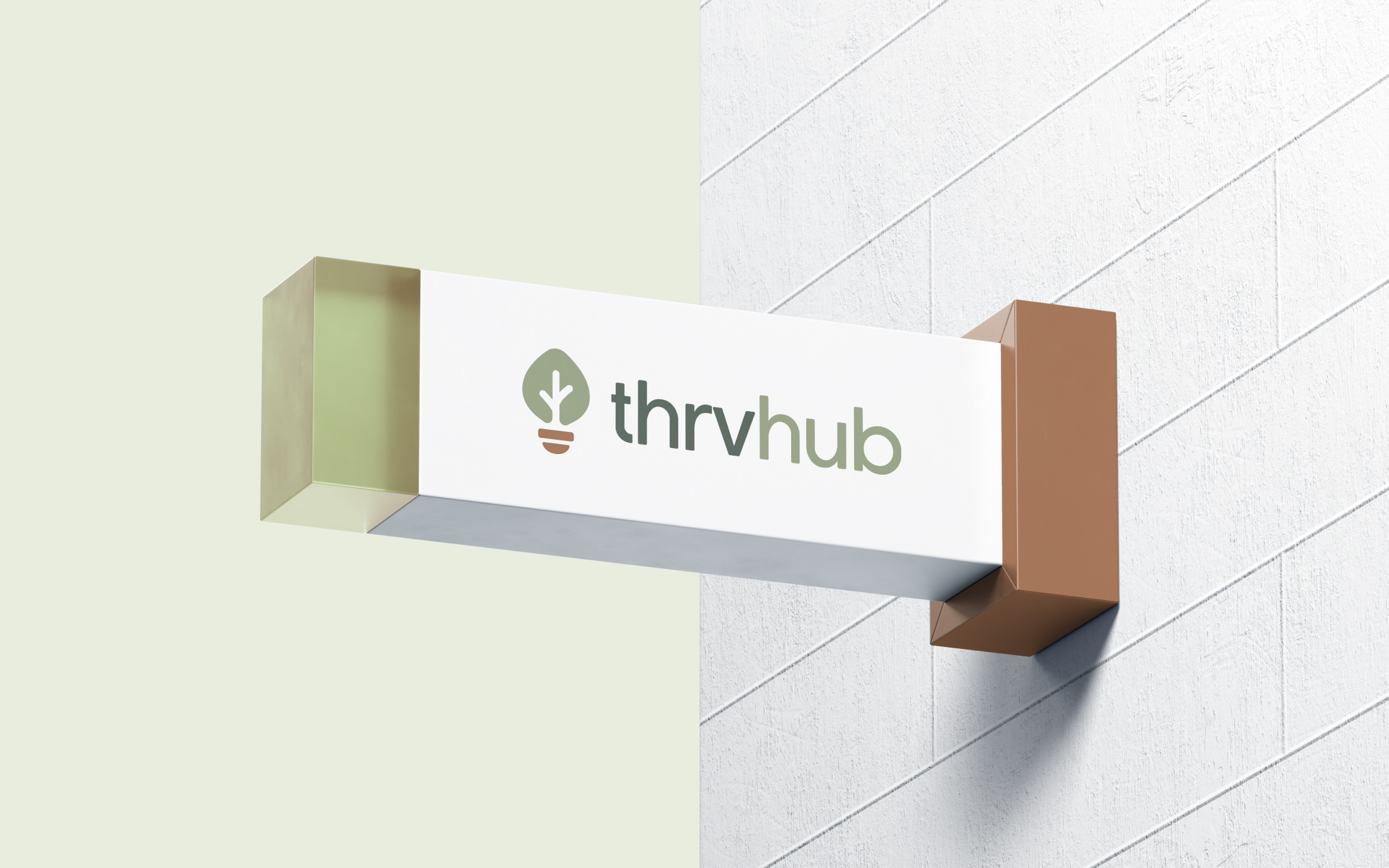
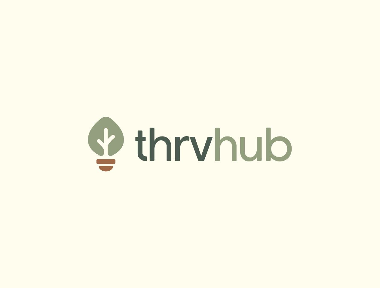
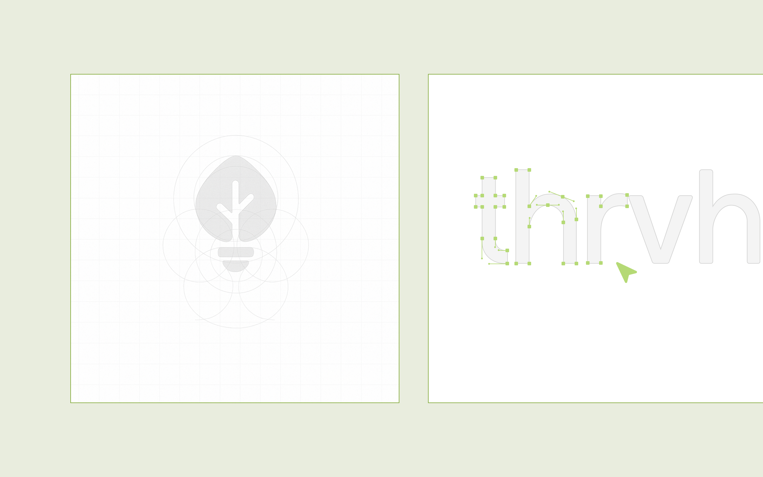
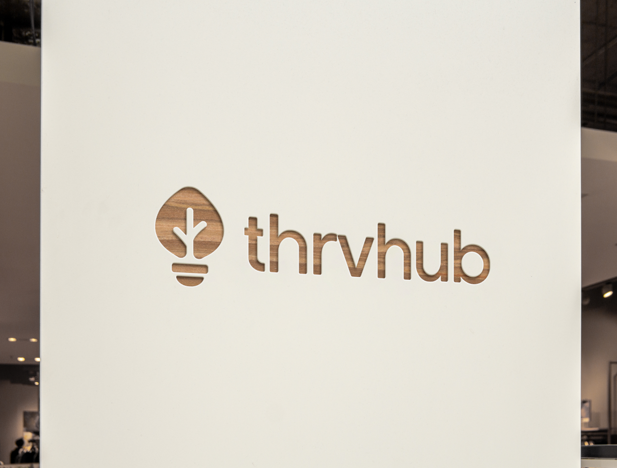
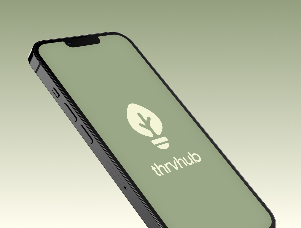
We focused on creating a logo and identity that visually represents growth, learning, and guidance. The symbol blends the imagery of a leaf and a lightbulb — a nod to both nature and knowledge. This combination reflects ThrvHub’s role as a place where learners can grow with confidence, while also highlighting their focus on practical, insightful education.
The colour palette was chosen with care: soft greens and earthy tones that feel calm, grounded, and inclusive. Paired with a modern, approachable typeface, the result is a visual language that feels both professional and welcoming.
The Result
The finished identity gives ThrvHub a strong, recognisable presence across digital and print. The logo adapts seamlessly across their website, course materials and communications, creating a unified look that’s easy for their community to connect with.
More importantly, the brand now embodies the values ThrvHub stands for — inclusivity, calmness, and accessibility. It helps them stand out in the education space and builds trust with students, families, teachers, and partners from the very first interaction.
Not sure what you need yet?
Totally fine. We’ll help you figure it out in the first few conversations.